Zebra House Rebrand
The Objective
Zebra House Coffee’s original branding was created with the intent of being easy to connect with. After establishing itself and its following, Zebra House Coffee must embrace a visual identity that is more uniquely them, including a menu system that aligns with this brand.
The Solution
Zebra House’s 3 main attributes – quality exotic coffees, warm atmosphere, and support of creativity – must be clear in the rebrand.
Branding & Menu Design
Student Project
-
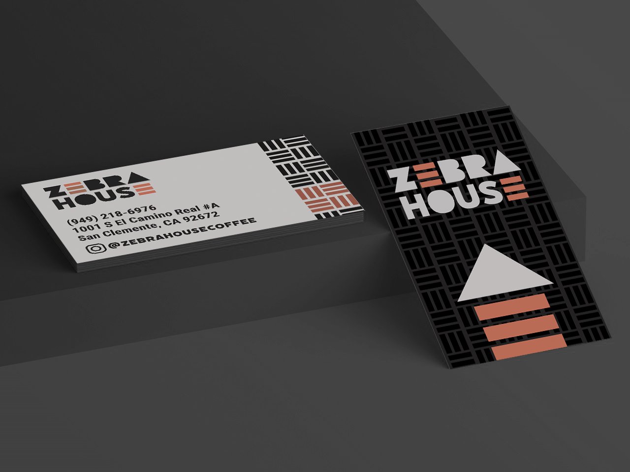
Type: Flegrei and Filicudi both incorporate ethnic and Bauhaus themes to connect to exotic coffees and creativity. The 3 brown bars replacing the E create a house form at the end of the logo, which translates to the brand favicon. Filucudi is carried through as a header font, while Roboto makes for a good body copy since it is a more simplified version of Filucidi.
Pattern: The three bars in the E are used to create mud cloth pattern that carries through the branding, drawing back to the logo.
Color: The sienna brown color provides a warmth that draws back to coffee and ethnic cloths, while the matte black introduces a fresh, chic quality to the brand which connects to the zebra element of the brand.
-
The new Zebra House menu system incorporates all elements of the brand to create a cohesive, user-friendly experience across platforms. The table-top flip menu to celebrate seasonal and popular options for each month will build the brand’s connection to its customers.